Welcome to GCC's redesigned website! Take a look around and enjoy what’s new. Have feedback? Tell us what you think—complete
our quick feedback form.Share your feedback!
The GCC brand color palette reflects similar hues from the original colors of cardinal
and gold. The new color palette uses cardinal and gold for the primary palette and
adds white and three additional grays as neutral colors for the secondary palette.
By simplifying the color palette, brand consistency and loyalty is created across
the applications.
The cardinal honors the original GCC brand. The color is deepened to reflect a more
vibrant contrast and legibility when paired with the gold. The deeper cardinal has
a stronger presence and a collegiate sensibility. The gold is a true golden hue and
has a dynamic contrast when paired with the cardinal. The secondary palette complements
the primary colors to balance and enhance the overall color palette.
Palladium Bold mirrors GCC’s contemporary values through a bold serif. The font’s
thickness in weight creates easy legibility and also reflects the ideas of stability
and bold presence.
When and where possible, always use the cardinal and gold.
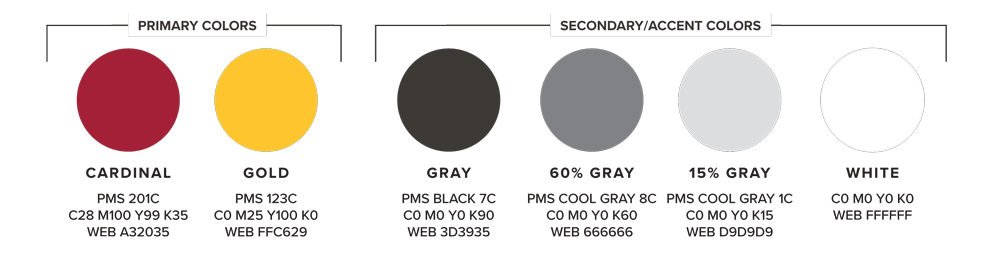
The image presents a brand color palette divided into Primary Colors and Secondary/Accent
Colors. Each color is shown as a solid circular swatch with labels and color specifications
underneath.
Primary Colors
Cardinal (Dark Red)
PMS: 201C CMYK: C28 M100 Y99 K35 Web (Hex): #A32035 Appearance: A deep, rich red tone.
Gold (Yellow-Gold)
PMS: 123C CMYK: C0 M25 Y100 K0 Web (Hex): #FFC629 Appearance: A bright golden yellow.
Secondary / Accent Colors
Gray (Dark Charcoal Gray)
PMS: Black 7C CMYK: C0 M0 Y0 K90 Web (Hex): #3D3935 Appearance: Very dark gray, close to charcoal.
60% Gray (Medium Gray)
PMS: Cool Gray 8C CMYK: C0 M0 Y0 K60 Web (Hex): #666666 Appearance: Neutral medium gray.
CMYK: C0 M0 Y0 K0 Web (Hex): #FFFFFF Appearance: Pure white.
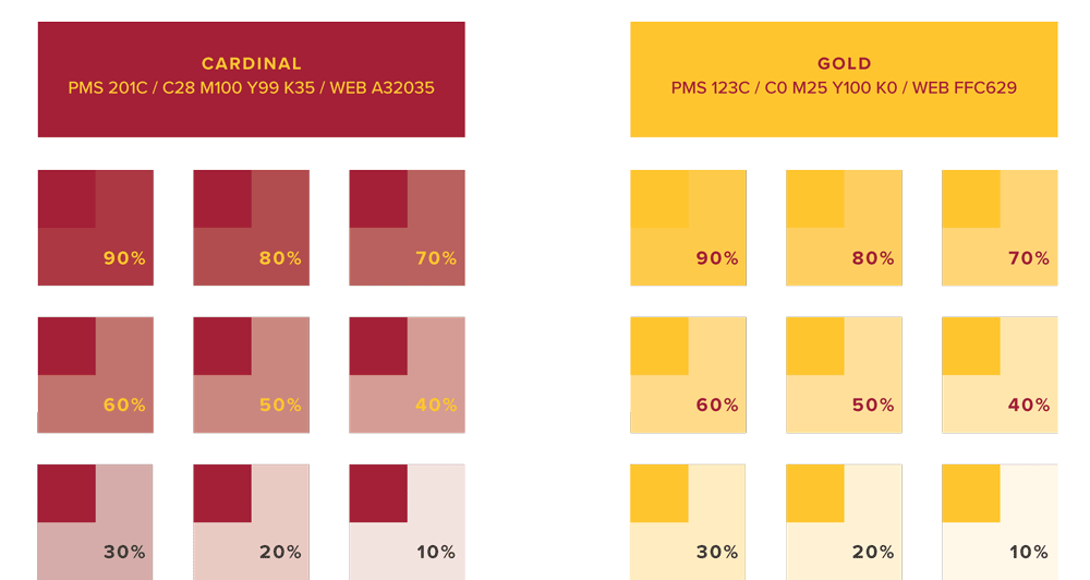
Colors & Variations
Cardinal and gold should always be used as your main colors (headers, color blocks)
and the shades of grey as accents. There may be times you want to incorporate tints
of the the cardinal or gold to create visual interest and movement. Below are variations
in tint:
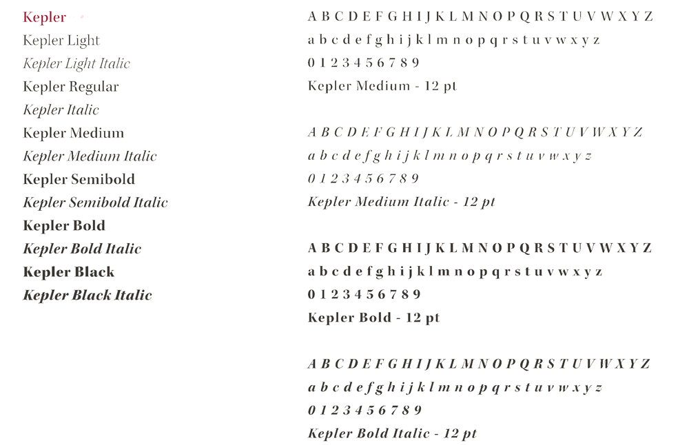
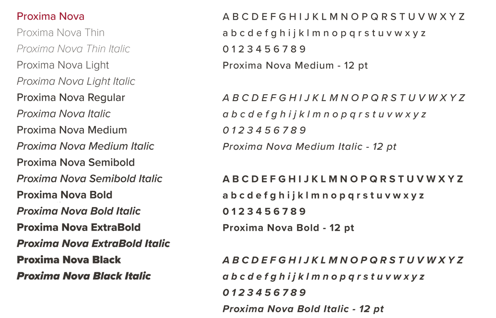
The official GCC fonts, Kepler and Proxima Nova, were chosen for their clarity, longevity,
and variety in font weights.
Kepler
Recommended use: Official documents, copy
PROXIMA NOVA
Recommended use: Header text (titles), copy, general use
FONT OPTIONS: SERIF
What is a serifed font exactly? In typography, the additional line (or flourish) at
the end of the larger letter is called a serif.
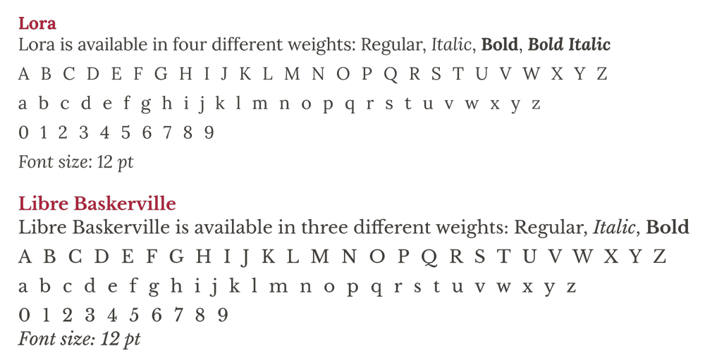

We recommend using serifs for body copy and/or official documents. If Kepler isn’t
available, please use the following free Google Fonts available for download:
Unlike their cousins serif fonts, sans serif fonts do not have the added line on each
characters – sans being the French word for without.
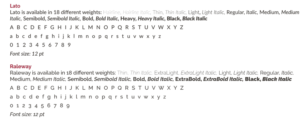
Recommended uses for this class of fonts are: header/title text, copy, and general
use. If Proxima Nova isn’t available, please use the following Google Fonts available
for download: